Vendor Shortlist vs Longlist Comparison Presentation
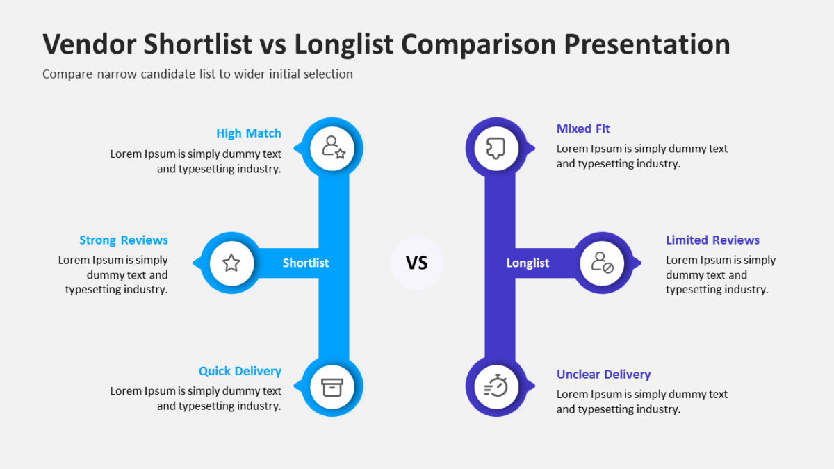
The Vendor Shortlist vs Longlist Comparison Presentation exists so the audience feels they reached the conclusion themselves.
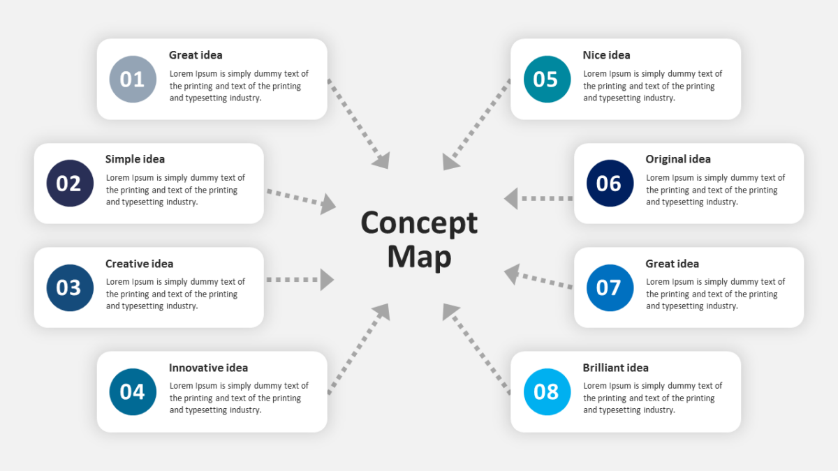
The value in mapping an operation is rarely the map. It is the conversation the map forces.
What’s on the slide
- Mirrored panels with matching heading rows
- A divider running between the two options
- Space beneath for a verdict line
- Aligned text blocks so like sits against like
- Icon slots at the top of each side
Every element is a native PowerPoint shape, so colors, icons and copy are all yours to change. Sized 16:9, and it opens cleanly in Google Slides and Keynote.
The usual audience is COOs, with quality managers and supply chain teams not far behind. Place it after the options are introduced and before you pick one. For a different treatment of the same idea, the rest of the continuous improvement templates are worth a look.