Continuous Improvement Path
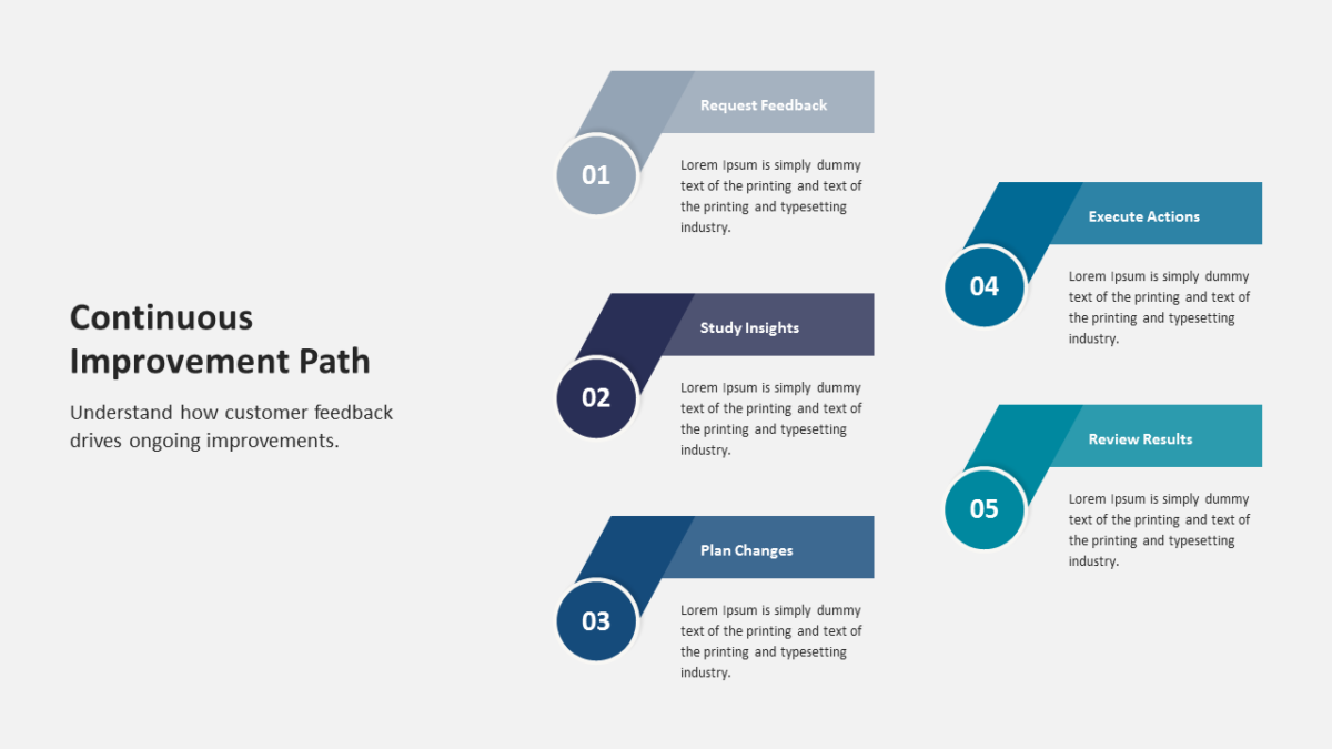
Plans get approved when people can see where they lead. The Continuous Improvement Path shows the destination.
Feature conversations drift into detail fast. Holding the overall shape on screen keeps the discussion at the level it was meant to be.
What’s on the slide
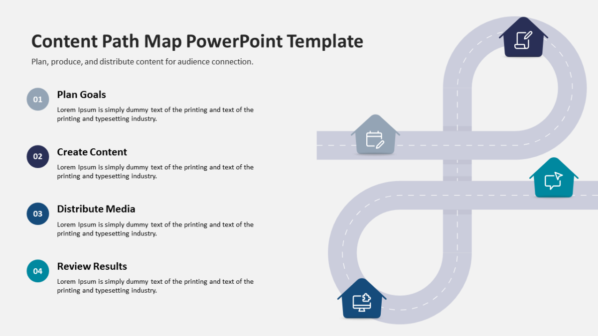
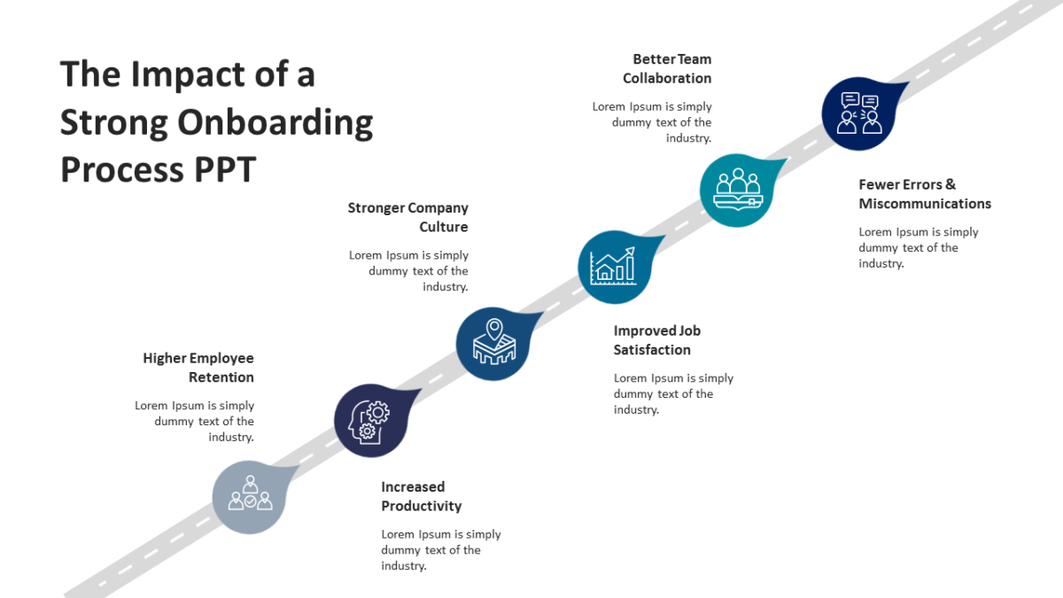
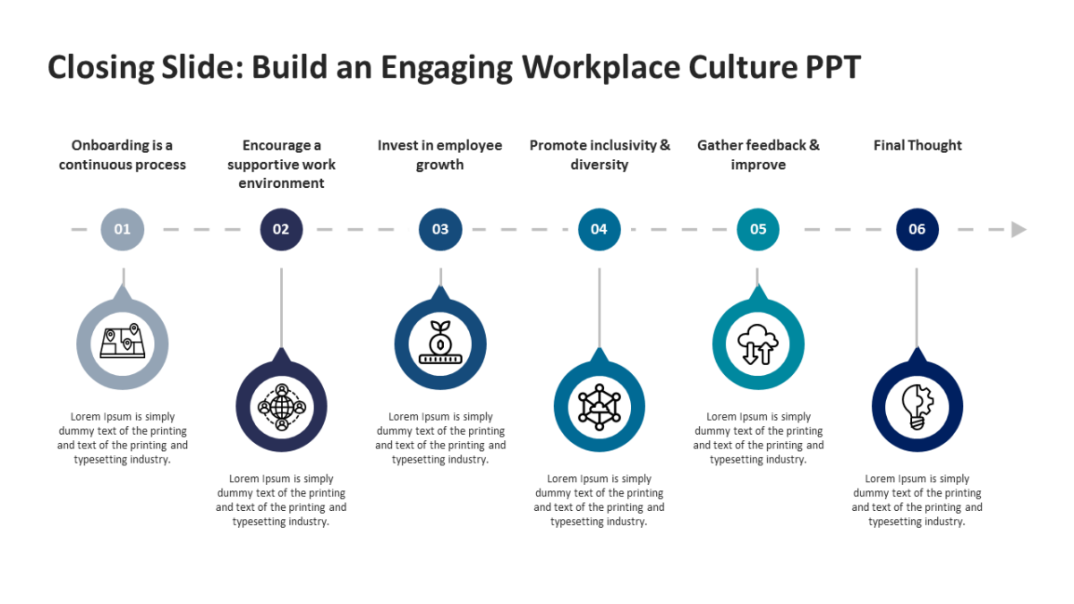
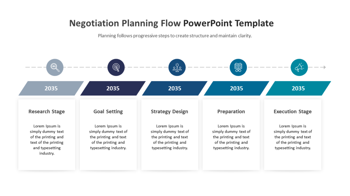
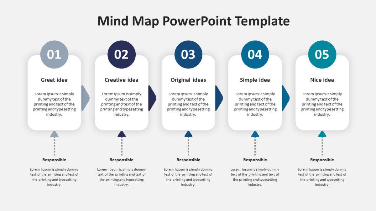
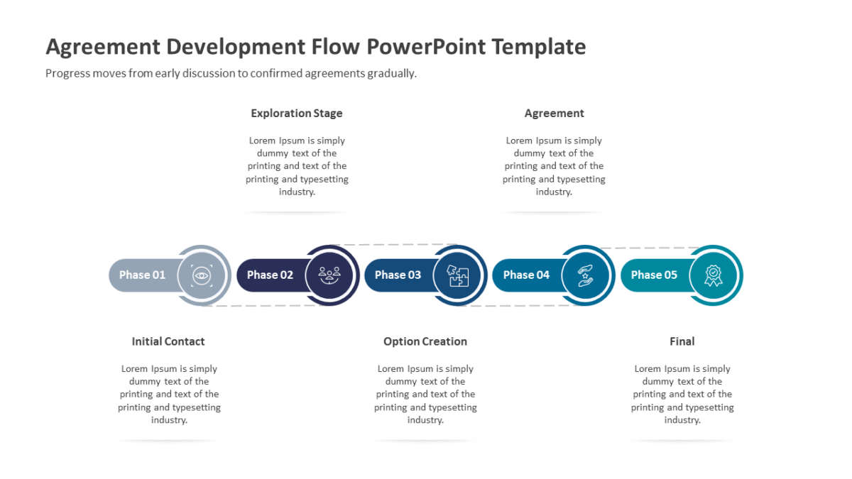
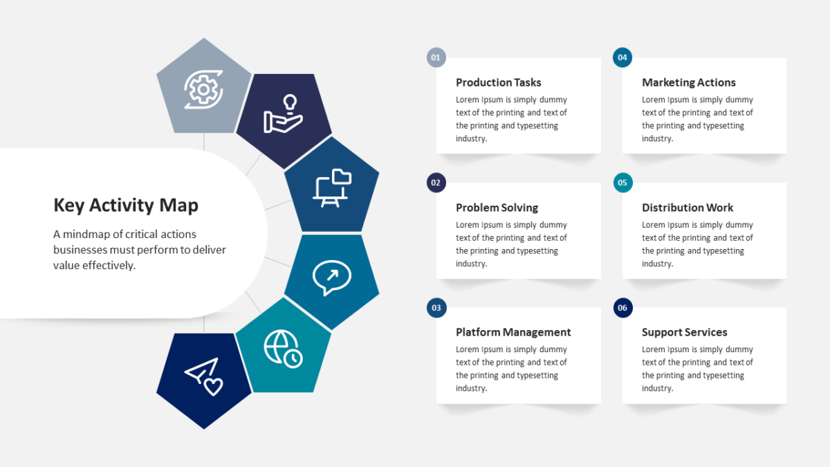
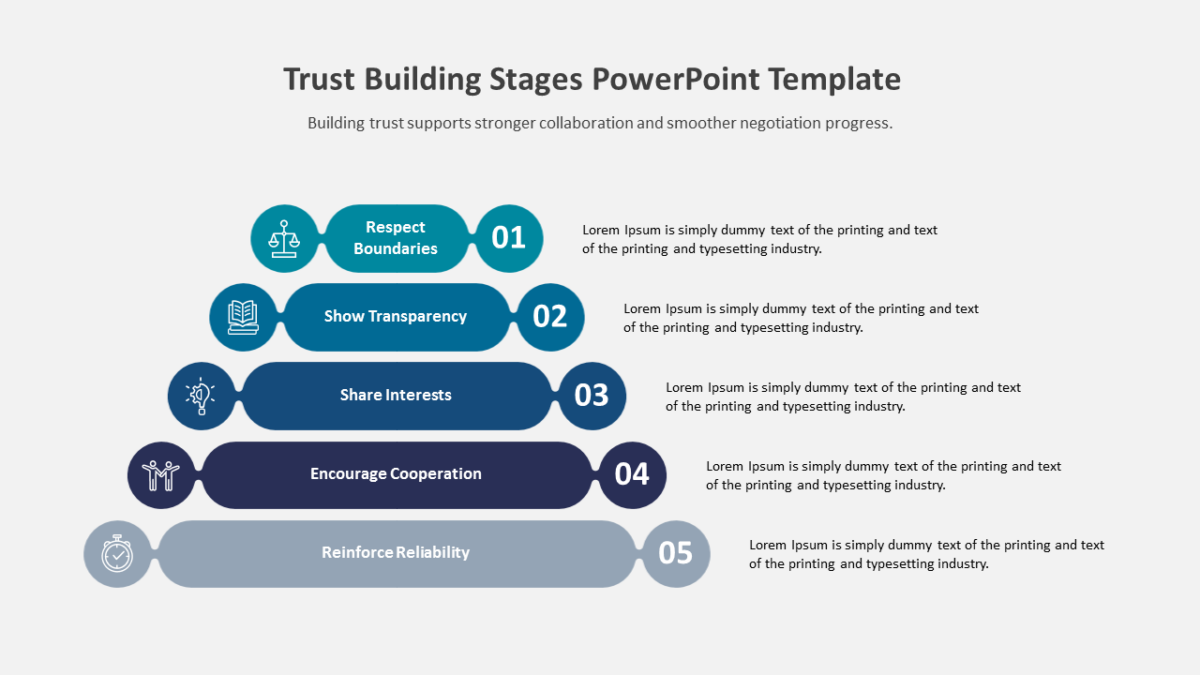
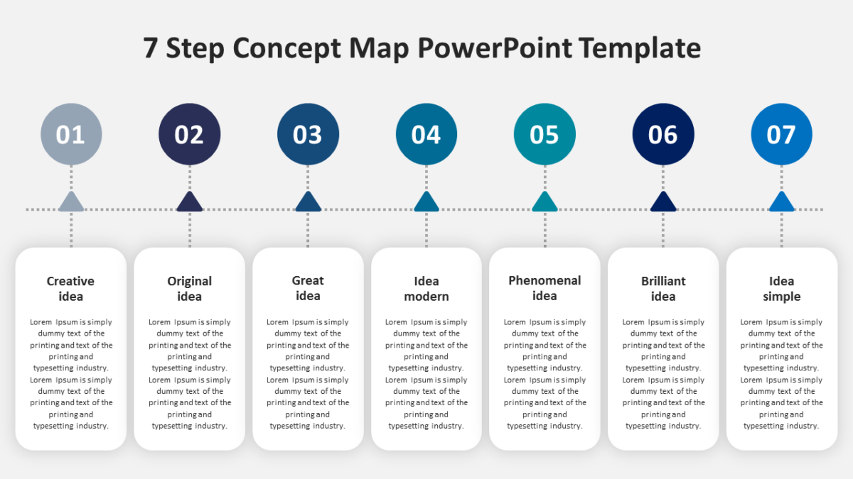
- A path running across the slide with marked stops
- Directional flow built into the route itself
- Title area with room for a timeframe
- Phase labels at every waypoint
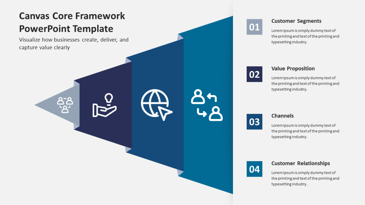
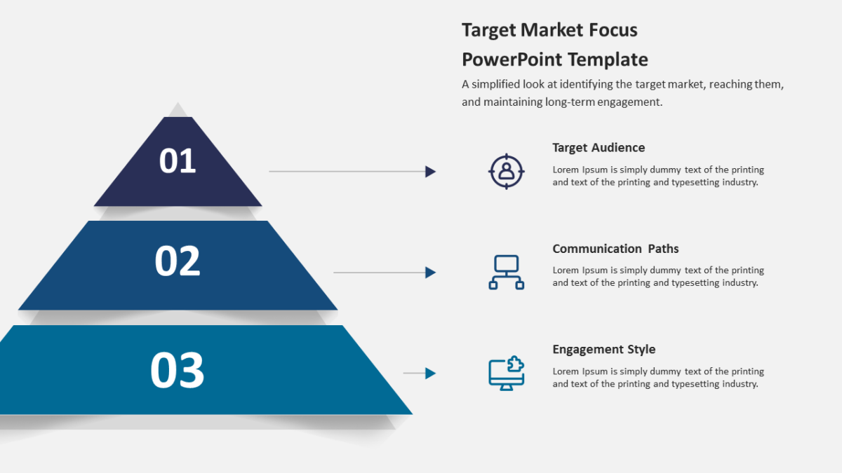
- Icon markers and a description panel per stage
The shapes are native objects rather than images, so restyling is quick. 16:9, and it opens properly in both Google Slides and Keynote.
The usual audience is design leads, with product managers and product owners not far behind. It reads best late, where the deck turns from analysis to intent. The other planning templates handle the same job at different scales.