Data-Driven Pie Chart Presentation Template
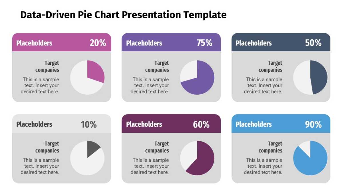
Share-of-total questions deserve a circle, and the Data-Driven Pie Chart Presentation Template is a well-built one.
Reps who can explain the process sell more than reps who improvise it. That starts with a version of the process everyone has actually seen.
What’s on the slide
- A data-driven pie that redraws when you edit the underlying numbers
- Distinct fill per slice
- A legend with editable series names
- Callout boxes for explaining the largest slices
All of it is editable, from the icon set to the fill colors to the text. 16:9 widescreen, compatible with PowerPoint, Google Slides and Keynote.
Built with account executives in mind, but revenue leaders and sales enablement put it to work just as often. It belongs in the data section, after the question and before the recommendation. For a different treatment of the same idea, the rest of the infographics templates are worth a look.