Timeline Infographic Using Circle
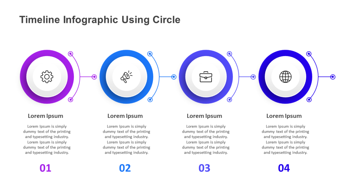
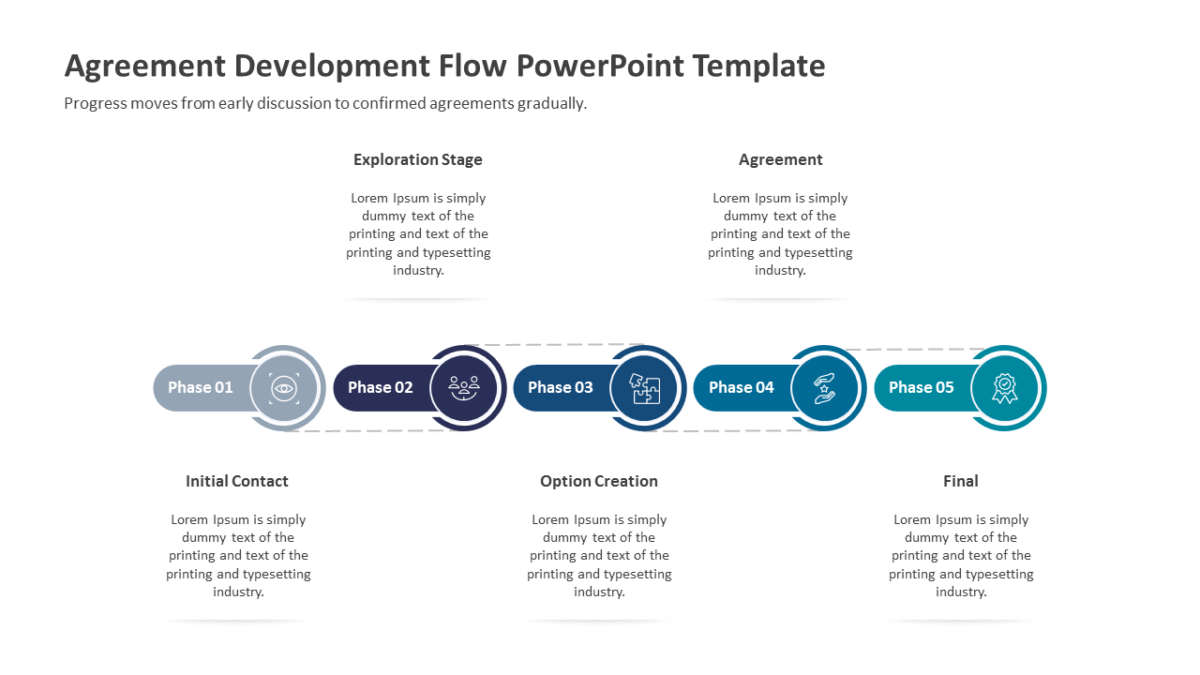
The Timeline Infographic Using Circle answers “where are we” before anyone has to ask it out loud.
Most decks lose people not through bad content but through slides that ask too much to decode. Good structure removes that tax.
What’s on the slide
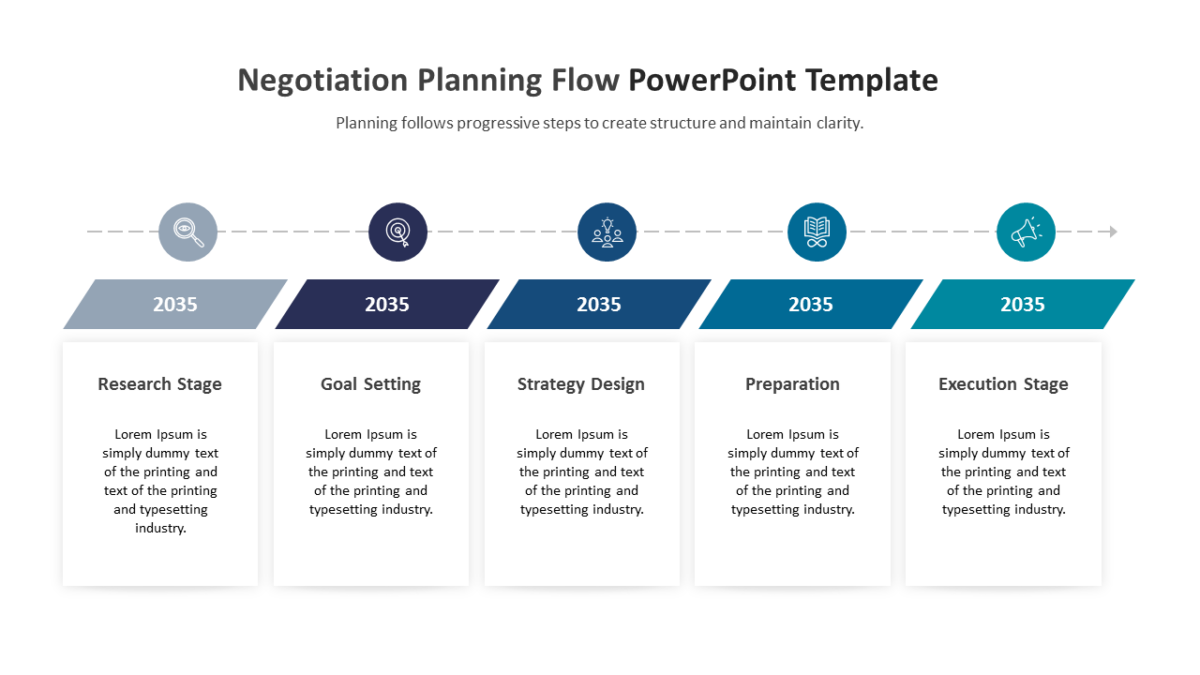
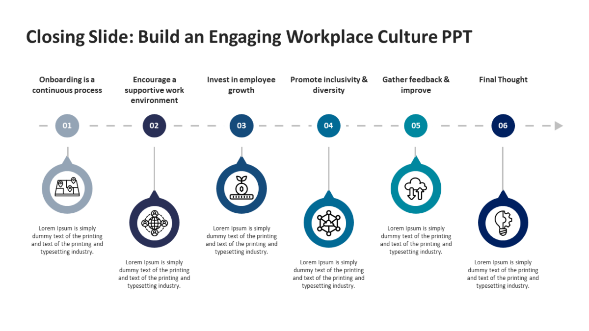
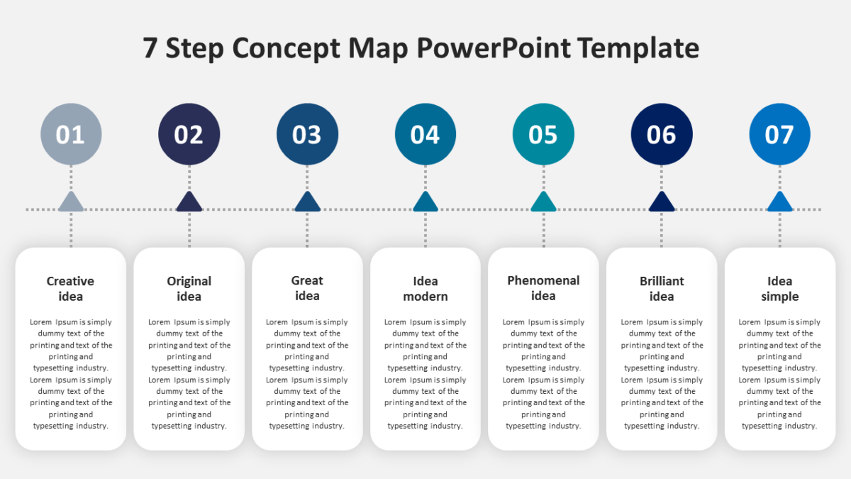
- A horizontal timeline axis with marked points
- Alternating callout cards above and below the line
- Date or period labels on every marker
- A heading and note field per milestone
- Icon slots at each point on the track
Nothing here is a flattened image. Shapes, fills, icons and text are individually editable, at 16:9, and the file behaves in Google Slides and Keynote too.
Consultants reach for this most, though executives and agency teams get the same value out of it. Use it in the planning section, or as the delivery slide near the close. The wider set of timeline templates picks up where this one leaves off.