Performance Indicator Cylinder Chart PowerPoint Template.pptx
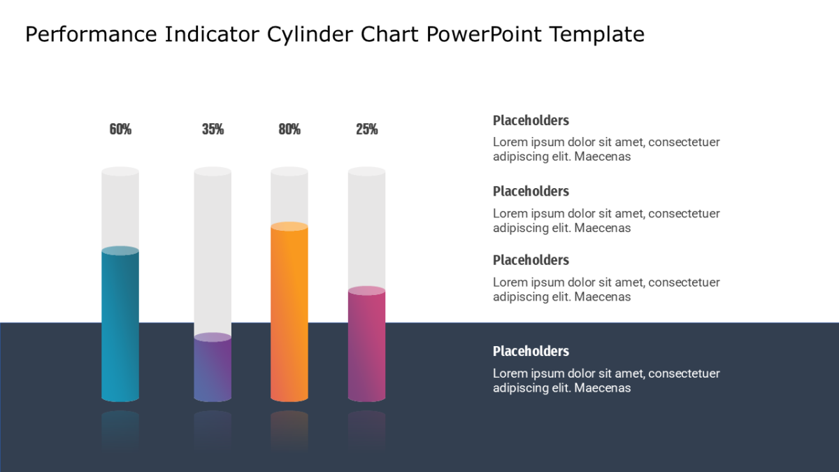
The Performance Indicator Cylinder Chart PowerPoint Template makes relative size instant, which no table ever manages.
The point of a finance slide is not to show every figure. It is to show the shape of the figures clearly enough that questions get specific.
What’s on the slide
- A data-driven column chart linked to an editable data sheet
- Space above the tallest bar for an annotation
- Category labels along the axis
- Value axis with gridlines
- A legend for multiple series
Every element is a native PowerPoint shape, so colors, icons and copy are all yours to change. Sized 16:9, and it opens cleanly in Google Slides and Keynote.
Finance managers will use it most often. So will controllers, and it holds up for FP&A teams too. It fits the results or performance section. If the count is wrong for your content, the other bar chart templates cover the same ground.