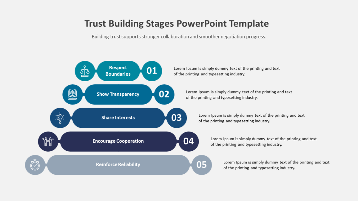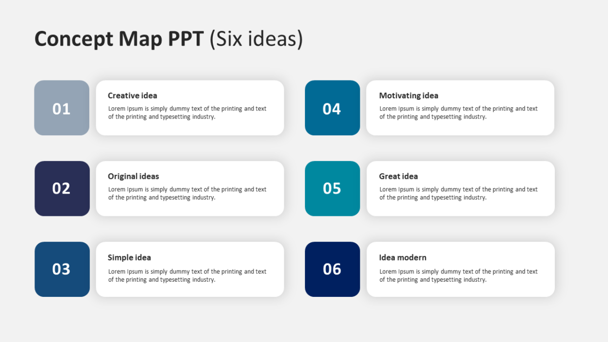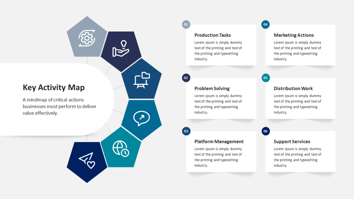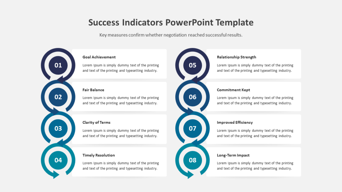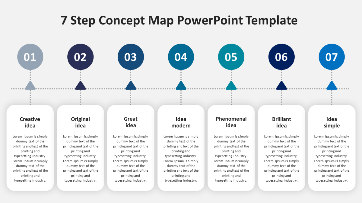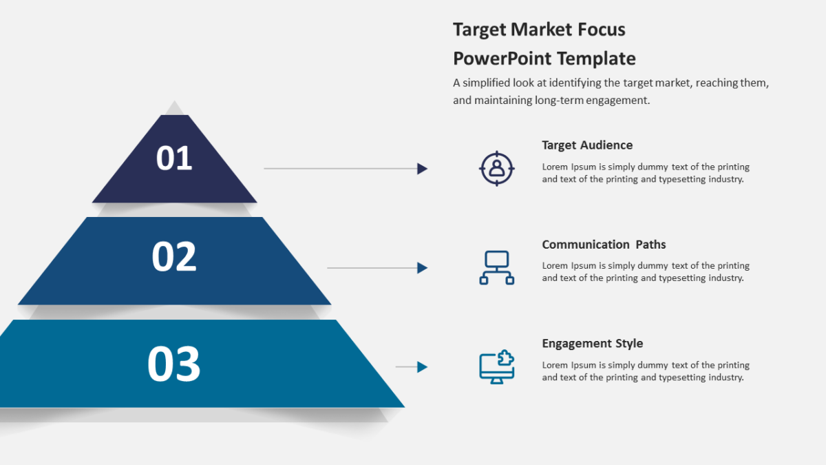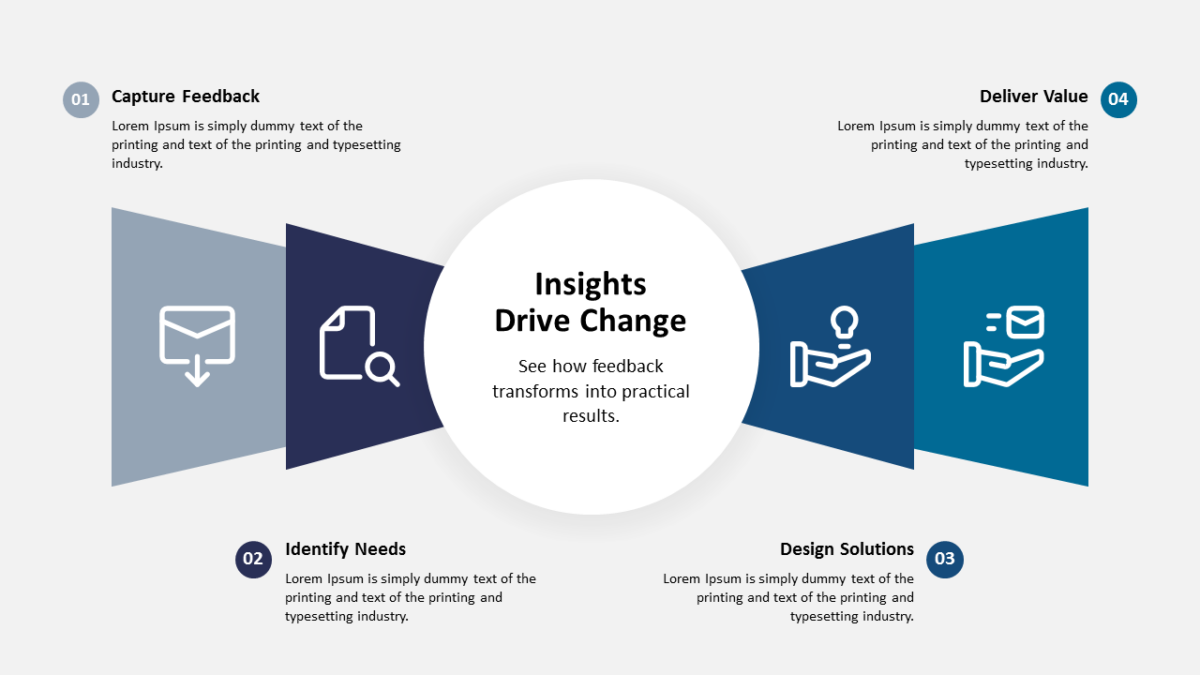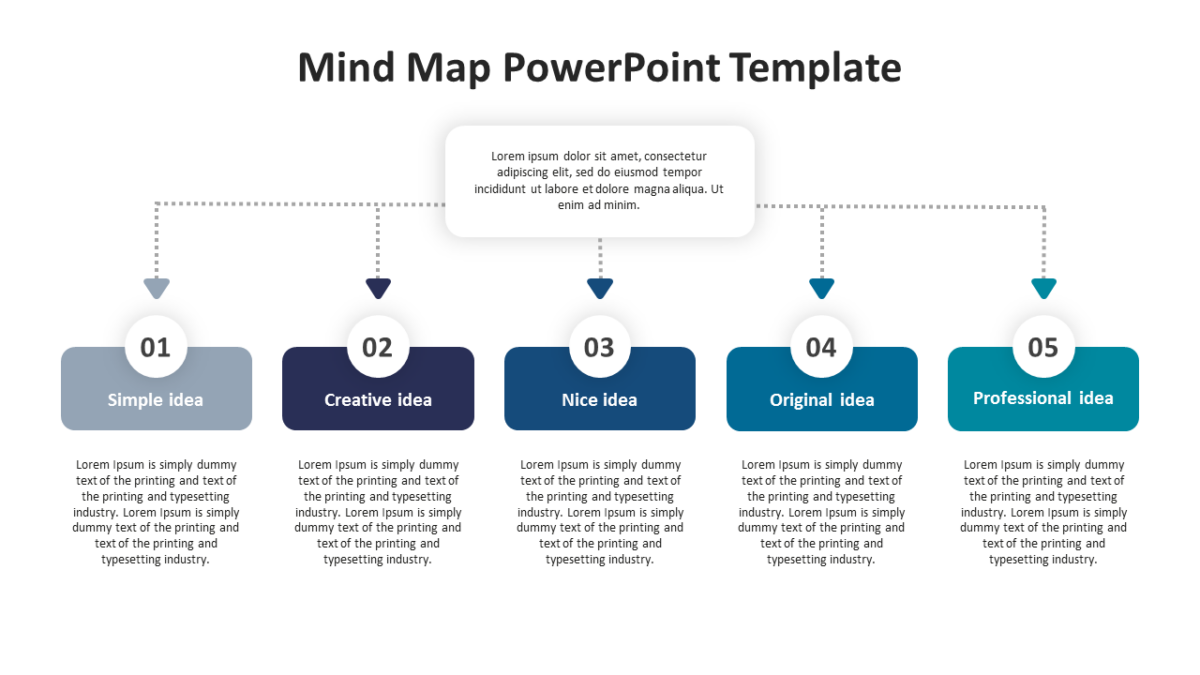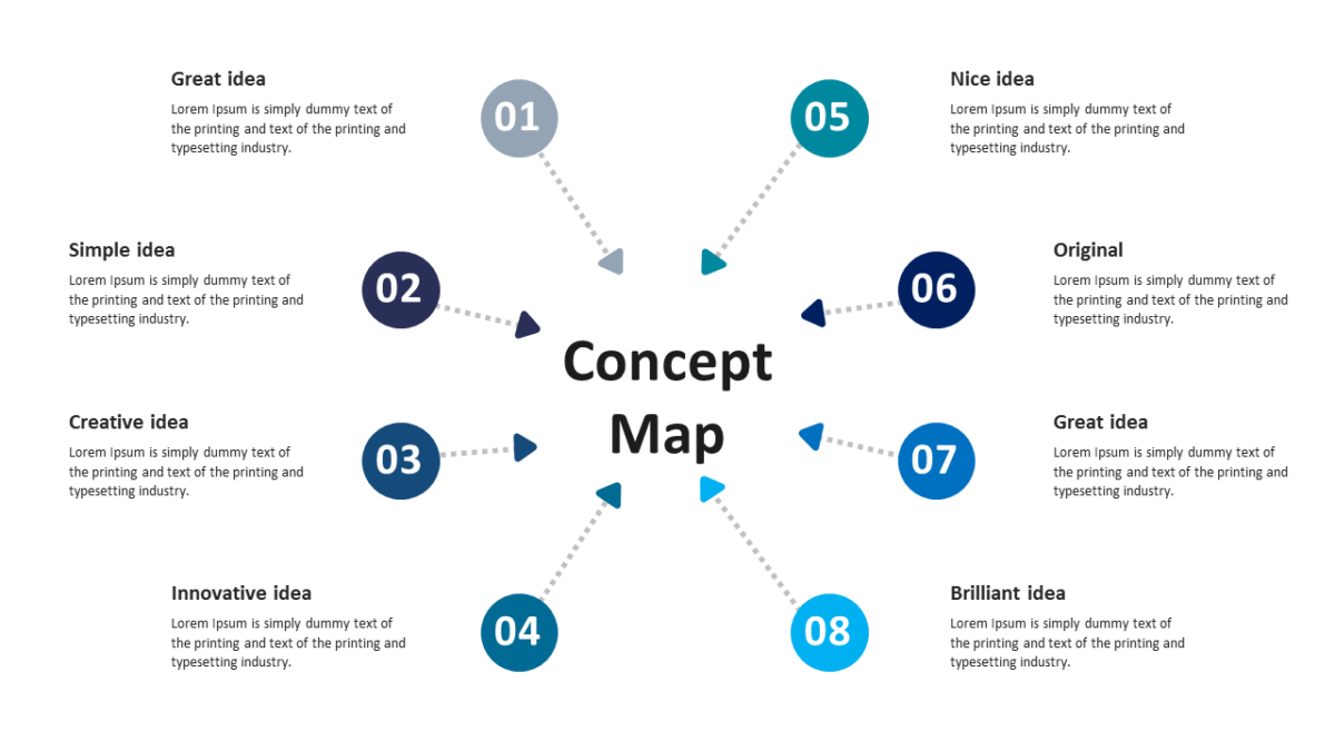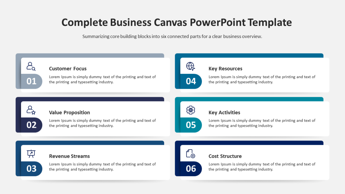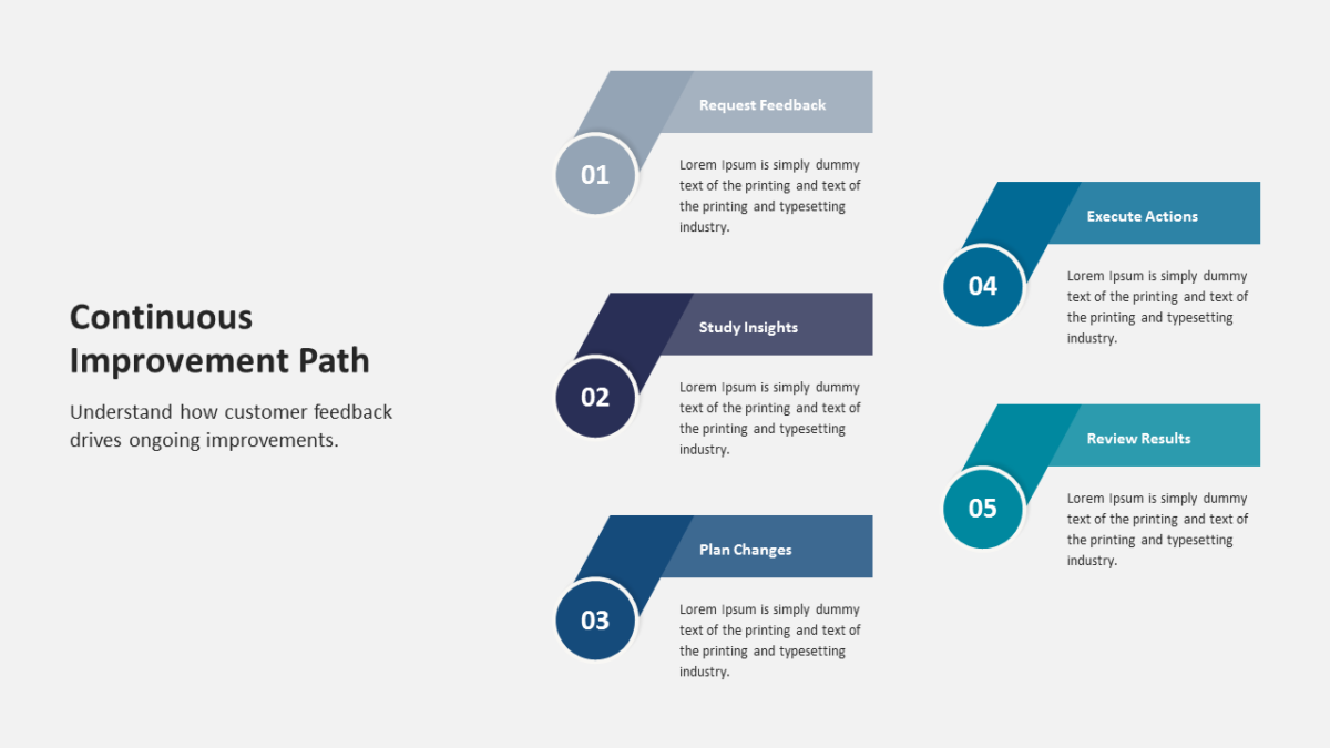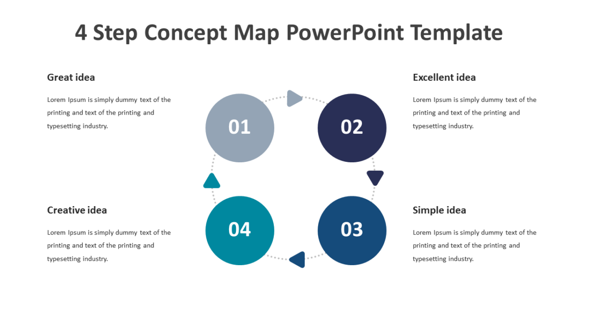
Split Circle Infographic Slide Design
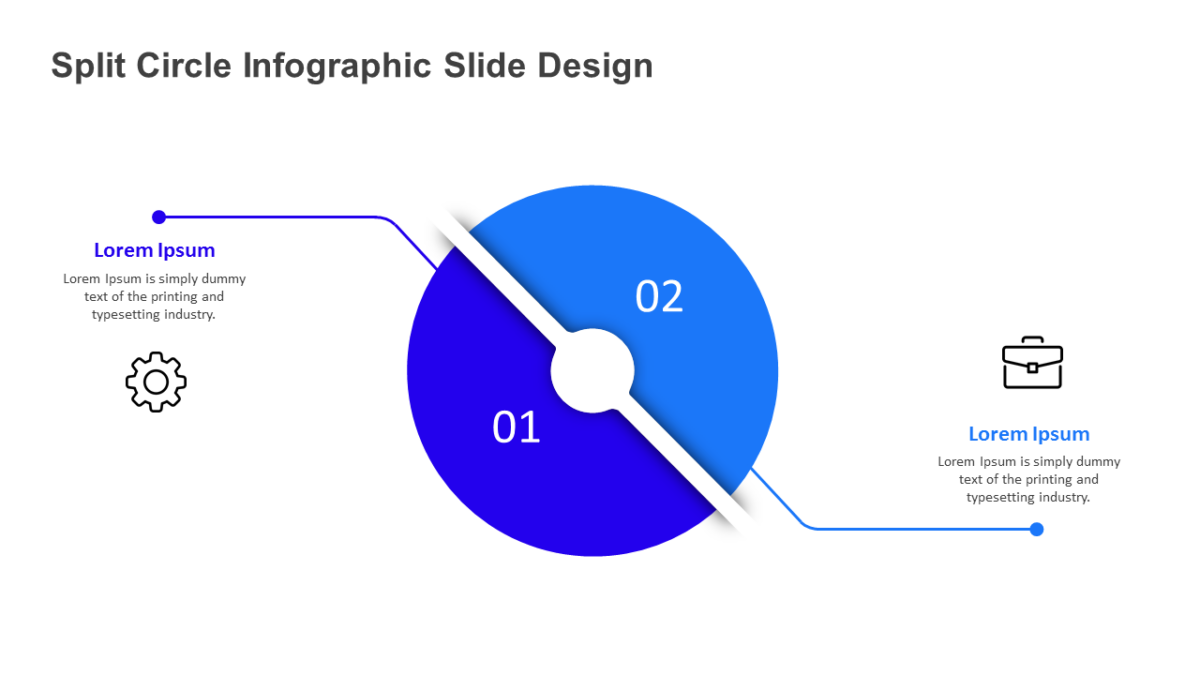
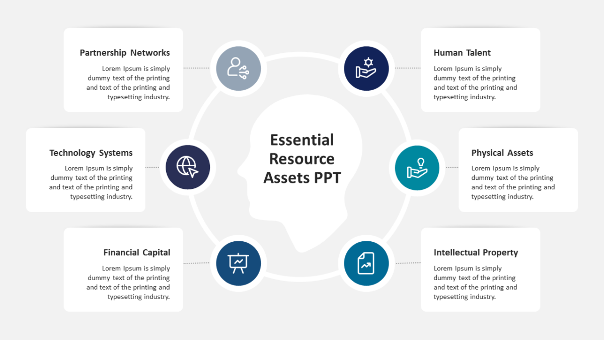
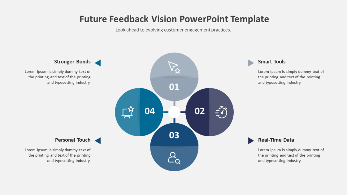
The Split Circle Infographic Slide Design shows a cycle as a cycle, so nobody assumes the last step is the end.
Most decks lose people not through bad content but through slides that ask too much to decode. Good structure removes that tax.
What’s on the slide
- A ring divided into segments
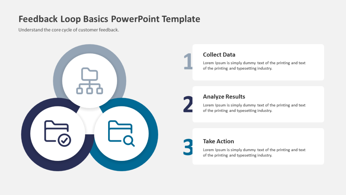
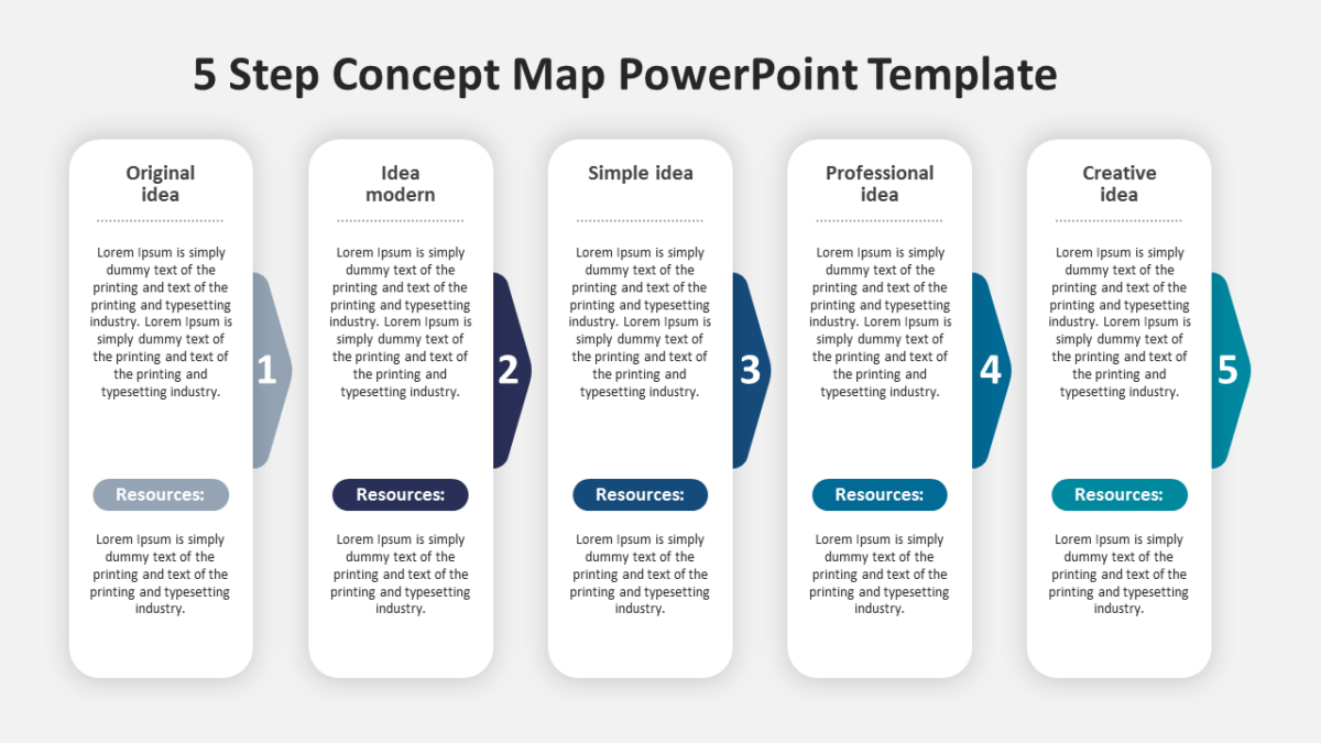
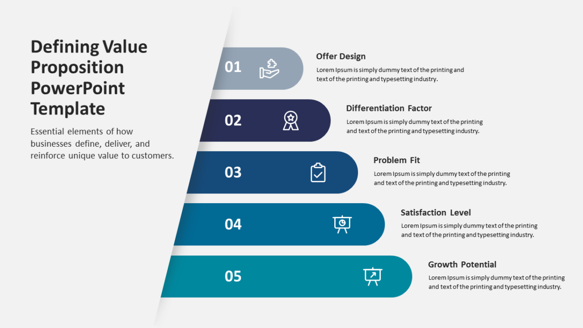
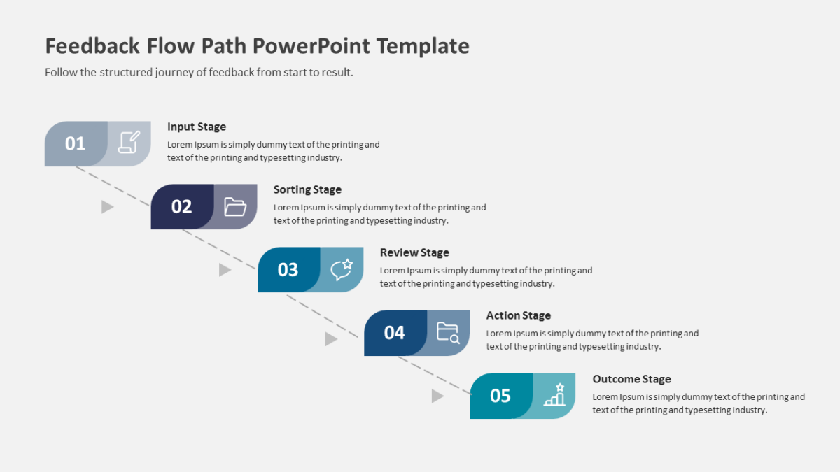
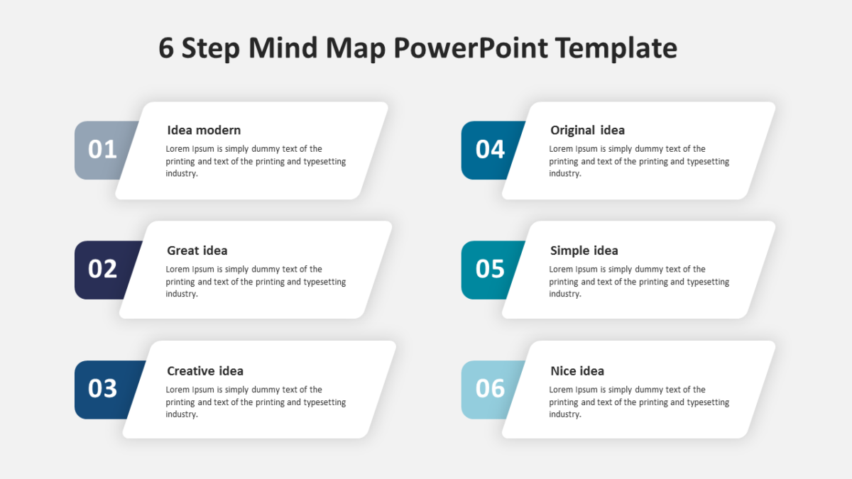
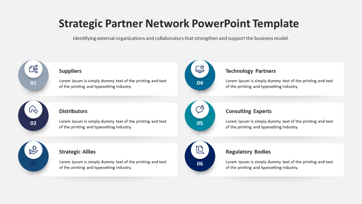
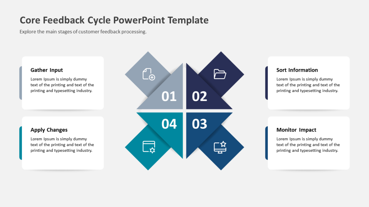
- An icon and text block for every stage
- Open space at the center for a title or summary
- Distinct fill per segment for quick reference
Colours, icons, headings and body text are yours to rewrite. Sized for 16:9 and compatible with Google Slides and Keynote alongside PowerPoint.
The usual audience is business analysts, with team leads and agency teams not far behind. Place it mid-deck, as the how-it-works slide. Browse the circular templates to compare a few layouts before committing.