Post Campaign Analysis & Continuous Improvement Presentation
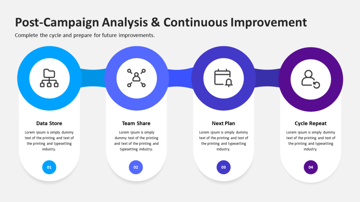
Drawing a recurring process flat misrepresents it. The Post Campaign Analysis & Continuous Improvement Presentation does not make that mistake.
Stakeholders approve marketing plans they understand. The fastest route to understanding is a diagram, not another paragraph of strategy language.
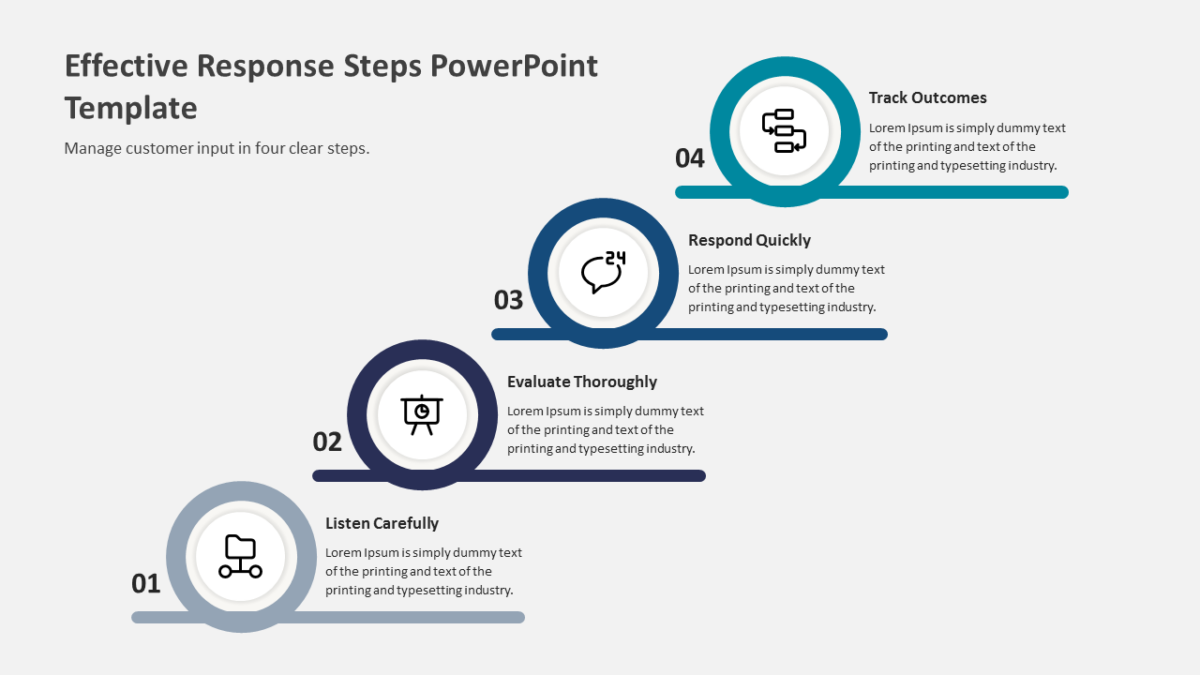
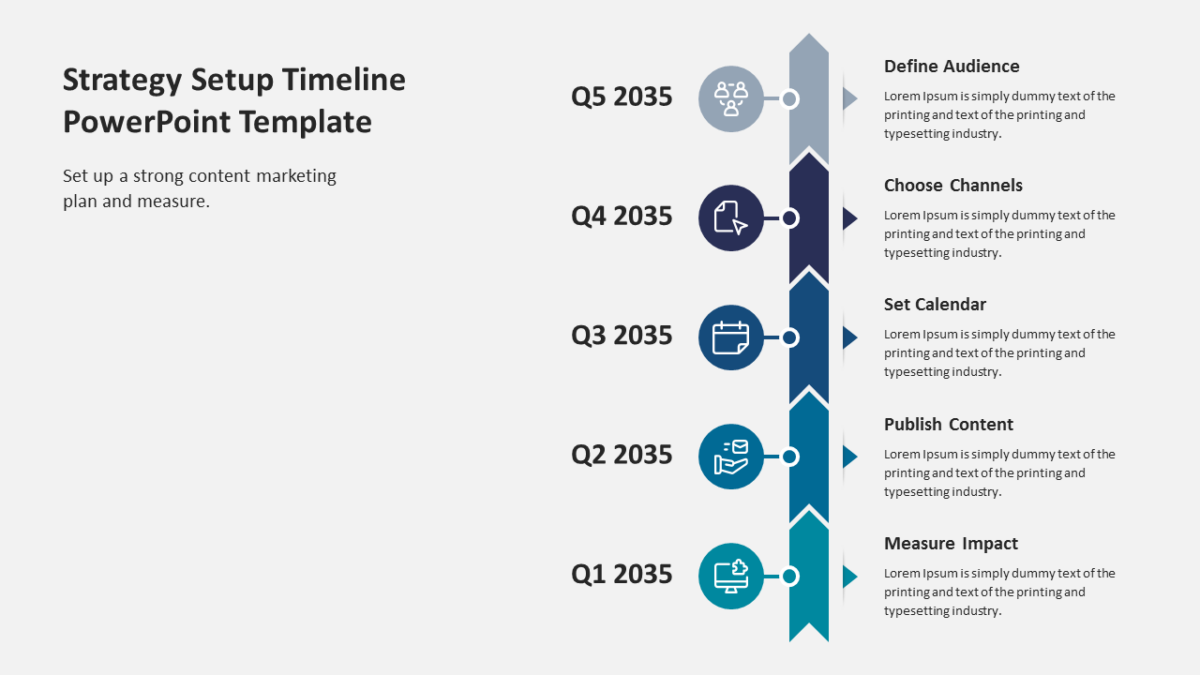
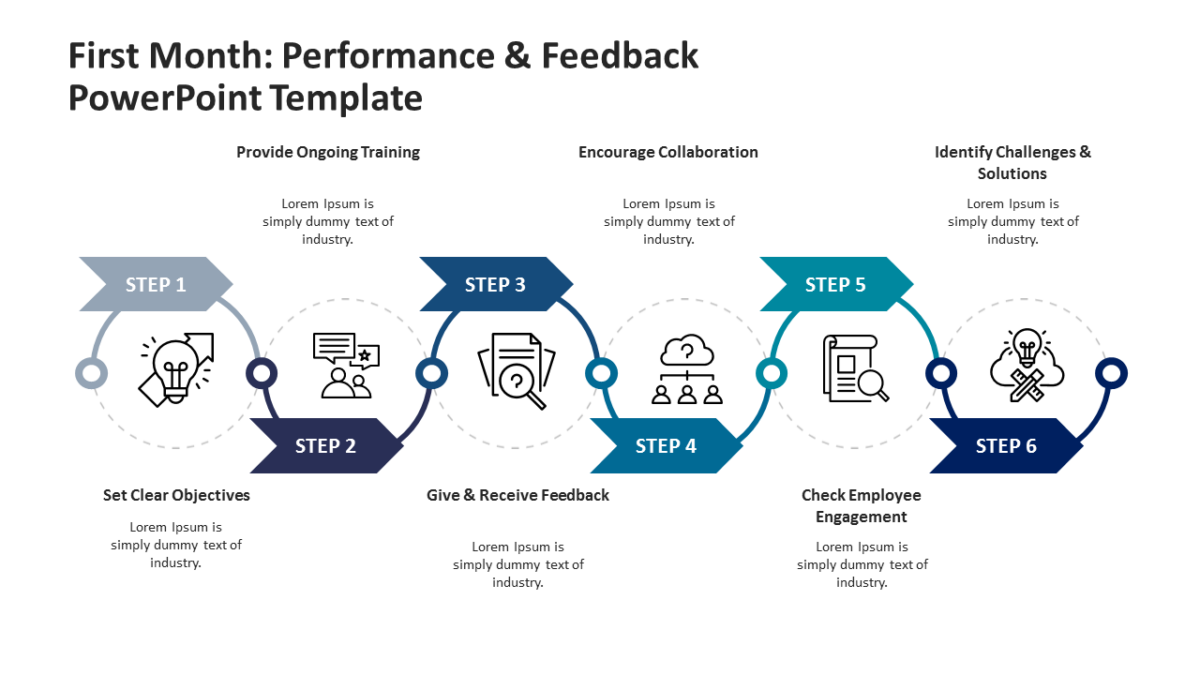
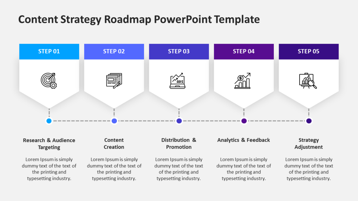
What’s on the slide
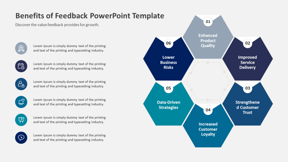
- A ring divided into 4 segments
- Directional arrows carrying the eye around the loop
- Open space at the center for a title or summary
- Distinct fill per segment for quick reference
Nothing here is a flattened image. Shapes, fills, icons and text are individually editable, at 16:9, and the file behaves in Google Slides and Keynote too.
The usual audience is growth teams, with brand strategists and campaign leads not far behind. It sits well in the methodology or operations section. There is more in the same vein across the workflow templates.