Before vs After Digital Transformation PowerPoint Comparison
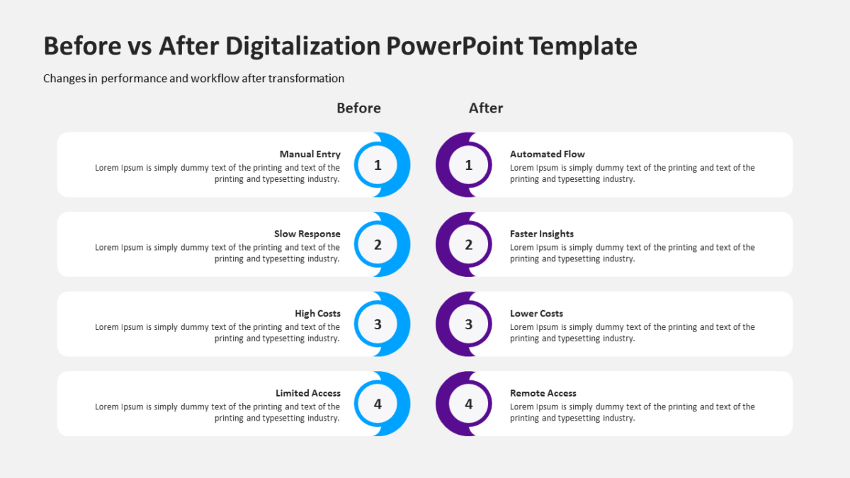
Comparisons persuade when they are symmetrical, and the Before vs After Digital Transformation PowerPoint Comparison is symmetrical.
Executive audiences decide fast and read little. A single well-built visual carries more of the argument than three slides of supporting prose.
What’s on the slide
- Mirrored panels with matching heading rows
- Space beneath for a verdict line
- Aligned text blocks so like sits against like
- Icon slots at the top of each side
Recoloring it to your brand takes a minute, because every shape is editable rather than pasted in. 16:9 widescreen, and it travels fine to Google Slides and Keynote.
The usual audience is corporate development, with management consultants and founders not far behind. It goes immediately before a recommendation. The other strategy templates handle the same job at different scales.