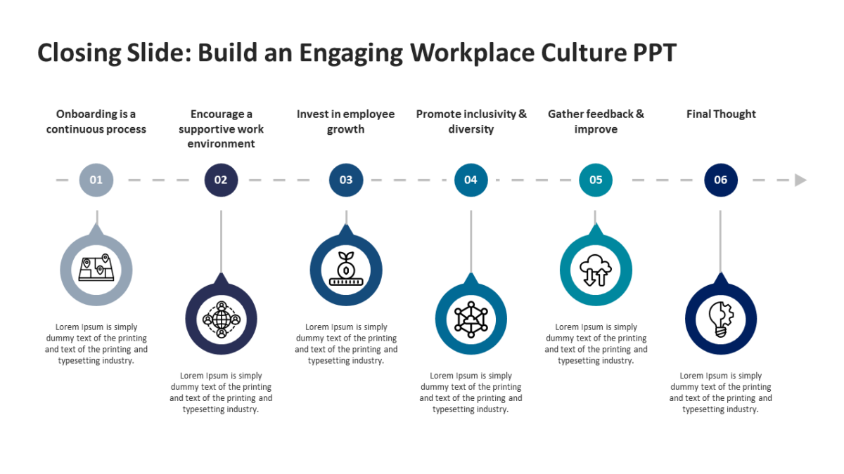
Six Stage Decision Comparison Model
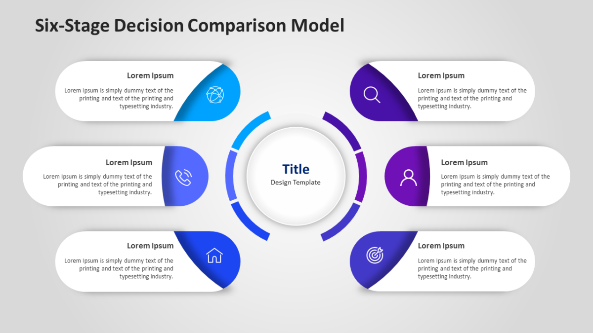
Two options, one slide, no ambiguity about which is which. That is the Six Stage Decision Comparison Model.
Most decks lose people not through bad content but through slides that ask too much to decode. Good structure removes that tax.
What’s on the slide
- Mirrored panels with matching heading rows
- A divider running between the two options
- Aligned text blocks so like sits against like
- Icon slots at the top of each side
- Space beneath for a verdict line
Colours, icons, headings and body text are yours to rewrite. Sized for 16:9 and compatible with Google Slides and Keynote alongside PowerPoint.
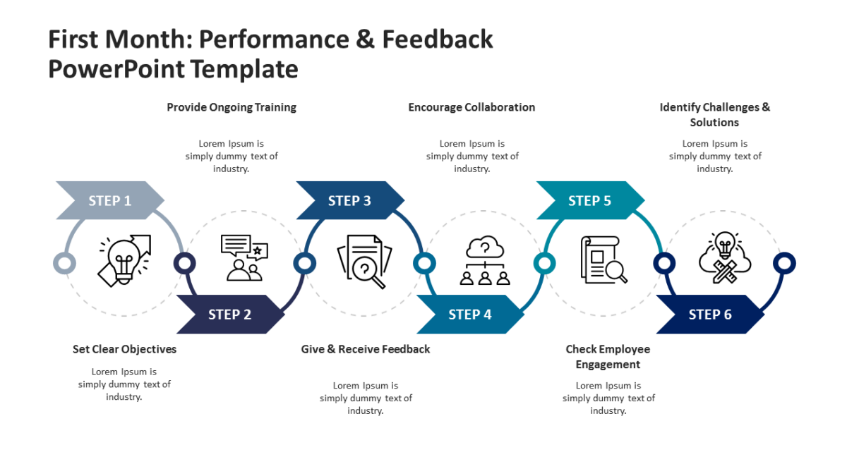
Executives reach for this most, though consultants and agency teams get the same value out of it. Use it when the audience needs to feel they chose. Browse the 6 steps templates to compare a few layouts before committing.