Stacked Bar Chart for Business Performance PowerPoint Templates
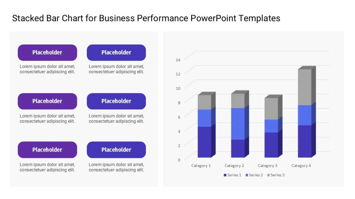
The Stacked Bar Chart for Business Performance PowerPoint Templates makes relative size instant, which no table ever manages.
Finance audiences are the most skeptical in any room and the quickest to spot a slide that hides something. Clean structure signals that the numbers underneath are equally tidy.
What’s on the slide
- A data-driven column chart linked to an editable data sheet
- Value axis with gridlines
- A legend for multiple series
- Space above the tallest bar for an annotation
- Category labels along the axis
Every element is a native PowerPoint shape, so colors, icons and copy are all yours to change. Sized 16:9, and it opens cleanly in Google Slides and Keynote.
Finance managers will use it most often. So will FP&A teams, and it holds up for controllers too. It fits the results or performance section. If the count is wrong for your content, the other bar chart templates cover the same ground.