Traditional vs Digital Processes PowerPoint Comparison
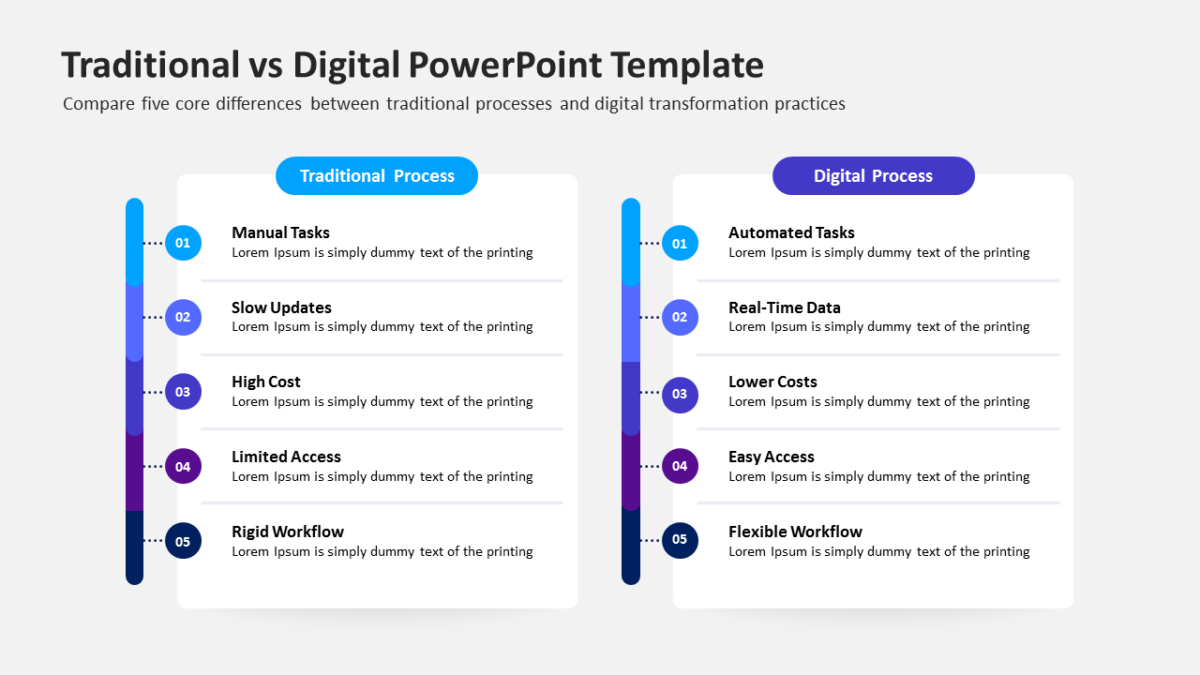
The Traditional vs Digital Processes PowerPoint Comparison exists so the audience feels they reached the conclusion themselves.
Alignment is a visual problem before it is a communication problem. People agree faster once they are looking at the same diagram.
What’s on the slide
- Mirrored panels with matching heading rows
- Icon slots at the top of each side
- Space beneath for a verdict line
- Aligned text blocks so like sits against like
Nothing here is a flattened image. Shapes, fills, icons and text are individually editable, at 16:9, and the file behaves in Google Slides and Keynote too.
Corporate development reach for this most, though strategy leads and founders get the same value out of it. It goes immediately before a recommendation. For a different treatment of the same idea, the rest of the strategy templates are worth a look.