Side by Side Comparison Diagram
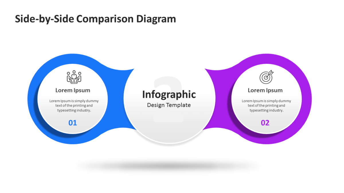
The Side by Side Comparison Diagram exists so the audience feels they reached the conclusion themselves.
The best business slides carry one idea properly rather than four badly. A clear layout makes that discipline easier to keep.
What’s on the slide
- Mirrored panels with matching heading rows
- A divider running between the two options
- Icon slots at the top of each side
- Space beneath for a verdict line
Drop in your own copy, swap the palette, resize what you need. Everything is a vector shape. 16:9, and Google Slides and Keynote handle it without issue.
The usual audience is consultants, with agency teams and business analysts not far behind. It goes immediately before a recommendation. If the count is wrong for your content, the other comparison templates cover the same ground.